Put the homepage headlines of five small businesses in the same trade side by side, and cover the logos. Often you can’t tell which is which. “Trusted, professional, affordable.” “Your one-stop solution.” “Quality you can rely on.” The businesses are different. The words are not.
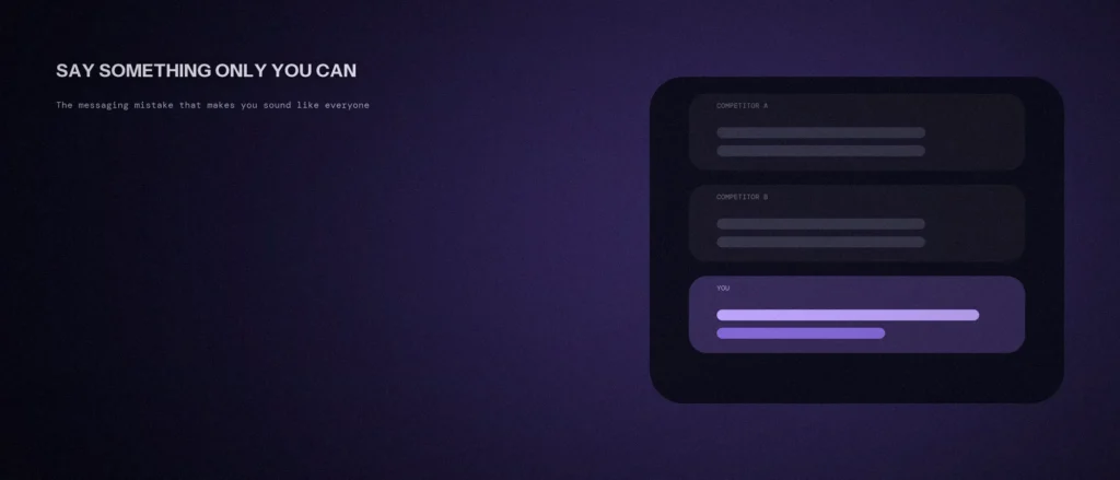
That sameness usually comes from one messaging mistake, and it’s easy to fix once you can see it. Here’s what it is, what usability research says about it, and a simple way to check your own page.
Quick summary, if you’re short on time:
- The messaging mistake is describing your business by its category and its features, the things every competitor also does, instead of who you help and what’s different.
- Nielsen Norman Group’s first homepage principle is “Communicate Who You Are and What You Do,” and it says your homepage should communicate your unique value proposition clearly.
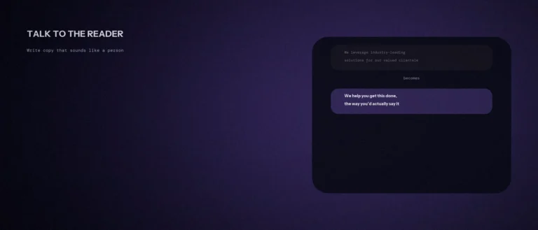
- Its advice is to avoid “jargon, business terminology, and feature-driven language” and to speak the user’s language.
- A quick test: could a competitor paste your headline onto their own page without changing a word?
- The fix is one specific customer, one specific problem, and one reason to believe you, not a longer list of services.
Jump to a section:
- The mistake: describing the category, not the difference
- What usability research says
- Where sameness hides on your website
- How to fix it
- A prompt to find what makes you sound like everyone else
- Questions worth answering directly
The mistake: describing the category, not the difference
Ask many owners what they do and they’ll name the category: “We’re a digital marketing agency.” “We do plumbing.” “We’re an accounting firm.” Then they list the services, and add words like quality, trusted and professional. Every competitor can say all of that, so none of it separates you from them.
A visitor comparing three options is really asking a different question: which of these is right for someone like me? A category and a feature list can’t answer it. Only a specific customer, a specific problem and a specific reason to believe you can. This is the same gap covered in our post on why “we provide quality service” means nothing, but at the level of your whole positioning.
What usability research says
Nielsen Norman Group’s homepage design principles put this first. The second of its five principles is “Communicate Who You Are and What You Do,” and it advises you to “treat your homepage as an elevator pitch to prospective customers, quickly and clearly conveying what your organization does.”
It goes further on differentiation: “Your homepage should communicate your unique value proposition clearly, usually through a descriptive tagline and compelling content.” And on wording: “Your homepage should speak the users’ language. Use words that resonate with people and avoid jargon, business terminology, and feature-driven language.”
A related NN/g article, on user-centric versus maker-centric language, shows the difference with product pages. One hiking-boot seller used branded feature names without explaining what they did for the wearer, while a competitor paired each feature with a plain benefit. One honest note: that article is practitioner guidance with worked examples, not a numbered study, so treat it as a strong rule of thumb, not a statistic.
Where sameness hides on your website
- The headline. It names the category (“Digital Marketing Agency in Bangalore”) and stops. Visitors already know the category from the search result.
- The services list. Five or six services in a row, identical to every competitor’s, with no hint of which one you’re best at.
- The “why choose us” bullets. Experienced, affordable, customer-focused. Nobody says the opposite, so nobody learns anything.
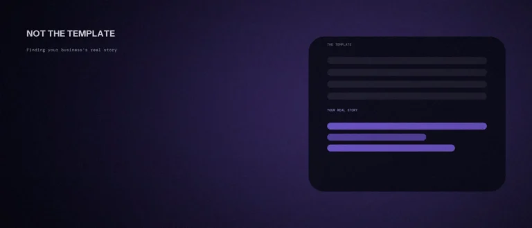
- The About page. A founder story built from the same template, which we covered in our post on finding your real business story.
How to fix it
Start with the competitor test. Take your homepage headline and imagine your closest rival pasting it onto their page. If it still works without a single change, it’s a category label, not a message.
Then rebuild it from three answers:
- Who exactly is it for? Not “businesses.” A specific kind of customer in a specific situation.
- What problem do they have right now? In their words, not yours.
- Why should they believe you can fix it? A process, a limit, a promise or a real example, not an adjective.
Here’s the difference, as a made-up example, so use your own facts. Before: “We provide affordable, professional web design.” After: “We build simple websites for local clinics that need patients to book online, and we show you the booking form working before you pay the final invoice.” The second one names who, what and a reason to believe, and no competitor could paste it onto their page. If you can say it in one sentence, that’s the one-sentence test passed.
A prompt to find what makes you sound like everyone else
Many small businesses use the same words: quality, trusted, best. The prompt below helps you find those words in your own text. Paste in your homepage copy, then answer honestly what you do differently.
Act as a messaging editor. I will paste my homepage text.
Here is the text:
[paste it here]Please do the following:
1. List every phrase that a competitor could also use.
2. Ask me 5 questions about what I do that others in my field do not.
3. After I answer, suggest 3 replacement lines using only my answers.Rules:
– Do not invent differences, awards or numbers.
– Use plain words.
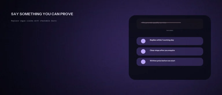
– Do not make claims I cannot prove.
Replace the generic lines with specific ones you can back up. Then ask a customer whether the new wording sounds true.
Questions worth answering directly
What is the messaging mistake that makes businesses sound alike?
Describing the business by its category and features, such as “digital marketing agency” plus a services list, instead of who it helps and what’s different. Every competitor can say the same things, so nothing separates you.
What does Nielsen Norman Group say a homepage should communicate?
Who you are and what you do, plus your unique value proposition, usually through a descriptive tagline and compelling content. It also advises speaking the user’s language and avoiding jargon, business terminology and feature-driven language.
How do I know if my headline is too generic?
Use the competitor test. If your closest rival could paste your headline onto their page without changing a word, it’s generic. A good headline names a specific customer, a specific problem or a specific reason to believe you.
Does being specific mean I’ll lose customers outside that niche?
Usually not, because people outside the niche can still hire you. A specific message makes the right customers feel understood, and your services pages can still describe the full range. The headline just needs to say something a generic one can’t.
What should I do if my services really are the same as my competitors’?
Differentiate on something else you can prove: who you serve, how you work, what you refuse to do, or what happens when something goes wrong. Nielsen Norman Group’s advice is to show how you address needs in distinctive ways compared to competitors.
Is the Nielsen Norman Group language research based on a large study?
Not the user-centric versus maker-centric article, which uses worked examples and doesn’t cite sample sizes. The homepage principles draw on Jakob Nielsen’s earlier homepage research, which the article says remains durable because it’s rooted in human behaviour.
Where this actually matters
When a visitor has three tabs open, the business that says something specific gets remembered and the others blur together. Sounding different isn’t about clever slogans. It’s about being clear on who you’re for and why you’re worth choosing.
Not sure whether your own homepage passes the competitor test? We work through this as part of every website engagement we run.