Most website design mistakes do not look like mistakes. The site looks clean, the photos are good and the owner is proud of it. Then the phone stays quiet. For a service business, the site has one job: to make a stranger confident enough to call, message or fill in a form. Anything that gets in the way of that job is a design mistake, however nice each design element looks. Most of these common mistakes are easy to fix, and several make the page responsive and clearer on a phone. Fixing them also helps your calls to action, or CTAs, get noticed.
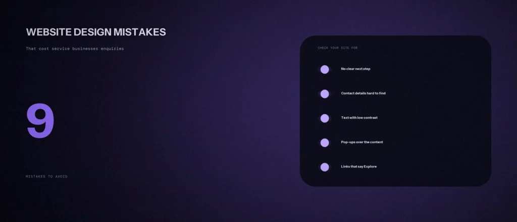
This post lists nine common website design mistakes, the website design mistakes to avoid if you sell a service, because each one costs enquiries. They are also web design mistakes that hurt user experience on web pages, and a search engine can struggle to understand some of them. Each one is tied to a source: W3C’s accessibility guidance, Google’s own pages or Nielsen Norman Group’s usability research, which we re-read on 11 October 2026. Where a point is our own opinion, or comes from checking our own site, we say so. We have made some of these mistakes ourselves, and we say which.
Quick summary, if you’re short on time:
- Make the next step obvious, and show how to get in touch without hunting.
- Text needs enough contrast. W3C’s standard asks for at least 4.5:1 for normal text.
- Google’s Core Web Vitals targets are an LCP within 2.5 seconds, an INP of 200 milliseconds or less, and a CLS of 0.1 or less.
- Google’s guidance says intrusive interstitials and dialogs may frustrate users and make a site harder for search engines to understand.
- Name links for where they go. “Explore” repeated on a page tells a visitor, and a screen reader, nothing.
Jump to a section:
- The 9 mistakes
- What our own site check found
- What to fix first
- A prompt to review your homepage
- Questions about website design mistakes
The 9 mistakes
1. A homepage that does not say what you do
If a stranger cannot tell, in a few seconds, what you do, who it is for and where, they leave. A slogan such as “Excellence in everything” tells the visitor nothing about the service. Say the plain thing first: “Dental clinic in Indiranagar, Bangalore. Root canals, braces and implants.” A quick test: show the page to a stranger for five seconds, then ask them to say what you do.
2. No clear next step
A page can be well written and still leave the reader with nowhere to go. Each page should have one main action, such as call, request a quote or book, and it should appear where the reader has finished reading and is ready to act. Our post on call-to-action placement covers how many and where.
3. Contact details hidden, and forms that ask too much
Nielsen Norman Group’s research on trustworthy design says people appreciate prominently displayed contact information. Put your phone number in the header or the utility navigation, as well as on the contact page. Then check the form. NN/g’s article on placeholders in form fields says placeholder text makes it difficult for people to remember what belongs in a field, and to check for and fix errors. Use real labels, and keep the fields short. We cover the full list in our post on contact page design.
4. Text that is hard to read
W3C’s contrast guidance says the visual presentation of text should have a contrast ratio of at least 4.5:1, with 3:1 for large text, and it gives the reason: some people cannot read faint text. Light grey on white, and white on a pale photo, are common ways to fail. Check your body text, your buttons and any text over images with a free contrast checker.
5. Pages that load slowly
Google’s Web Vitals guidance names three targets, measured at the 75th percentile of page loads: Largest Contentful Paint within 2.5 seconds, Interaction to Next Paint of 200 milliseconds or less, and Cumulative Layout Shift of 0.1 or less. Big uncompressed photos and many plugins are common causes. Our post on website speed fixes shows what to change without a developer.
6. Tiny buttons and links on a phone
W3C’s target size guidance says targets for pointer input should be at least 24 by 24 CSS pixels, with some exceptions. A thumb is not a mouse pointer. If phone and WhatsApp links sit close together as small text, people will tap the wrong one. Test your page on a real phone. Resizing a desktop window is not the same test.
7. Pop-ups that cover the content
Google’s page on intrusive interstitials and dialogs says they obstruct users’ view of the content, may frustrate them and erode trust, and can make it hard for search engines to understand your content. A cookie notice or a legal notice is a different case, and Google acknowledges that sites often need dialogs. The mistake is a full-screen offer that appears before someone has read anything.
8. Auto-rotating banners and sliders
Nielsen Norman Group’s study on auto-forwarding carousels describes a user who failed to find what she wanted, even though it was at the top of the page in a large font, because the panel auto-rotated instead of staying still. The article is from 2013, so it is an old study, but the behaviour it describes is easy to test yourself. If the most important message sits on slide three, most visitors will not see it. Put the main message in the first static view.
9. Links that do not say where they go
W3C’s link purpose guidance says the intent is to help users understand the purpose of each link so they can decide whether to follow it, and that assistive technology can list the links on a page. A list of ten links that all say “Read more” or “Explore” is useless in that list. Name the destination: “Local SEO in Bangalore”, not “Explore”.
What our own site check found
We audited our own site’s links earlier this month, on a local copy. Of 1,281 links in page bodies across 132 pages, none used “click here” or similar generic text. But the card button “Explore →” appears for 12 different destinations, and “View the service →” for 5. Each button sits in a card with its own heading, so a sighted visitor can tell where it goes. But in a list of links, or read by a screen reader, ten “Explore” links mean nothing. That is mistake 9, on our own site. We have fixed it: each button now carries its card’s heading as hidden text, so in a list of links it reads “Explore SEO services Bangalore”. The visible label is still “Explore” with an arrow.
What to fix first
This is our order, from our own experience, and not a rule from any source:
- Phone, WhatsApp and form work on a phone. If people cannot reach you, nothing else matters.
- The first screen says what you do and where. It is a fast change, costs nothing and changes what every visitor sees.
- Remove or delay anything that covers the content. Pop-ups, auto-sliders and chat boxes that open by themselves.
- Fix contrast and link names. Both are quick, and they help every visitor, including people who use assistive technology.
- Speed. Take the biggest images first.
Change one thing at a time, and write down the date, so you can see what moved your enquiries.
A prompt to review your homepage
An AI tool can read your homepage copy and link labels faster than you can. It cannot see colours, speed or layout, so give it the text, and use its answer for the parts it can judge.
Act as a critical, plain-speaking website reviewer. Review my homepage text for three problems only: unclear offer, unclear next step, and vague link labels. Use only what I paste.
My details:
– My business, the area I serve and who my customers are: [for example “a dental clinic in Indiranagar, serving families”]
– The homepage text in order, top to bottom: [paste]
– Every button and link label on the page, in order: [paste]
– The one action I most want visitors to take: [for example “call us”]Please do the following:
1. Tell me in one sentence what a stranger would think this business does, using only the first 100 words. Say if that is different from what I told you.
2. List every button or link label that does not name its destination, and suggest a clearer label for each.
3. Say whether the main action I want appears in the first screen’s worth of text, and where else it appears.
4. List what you cannot judge from text, such as colour contrast and speed.Rules:
– Use only my pasted text. Do not invent features or claims about my business.
– Say clearly when something is your opinion.
– Write in plain, simple English.
Check the parts the AI could not judge yourself, on a phone, in daylight.
Questions about website design mistakes
What is the most common website design mistake?
Not making the next step obvious. A visitor who cannot see how to call, book or ask for a quote will leave without telling you. Put the main action on every page, where the reader is ready to act.
Does website design affect Google rankings?
Some parts do. Google’s page experience guidance asks whether pages avoid intrusive interstitials and whether visitors can easily tell the main content from other content, and Core Web Vitals are part of the same guidance. Design that helps visitors tends to help search too.
How much contrast does text need?
W3C’s standard asks for a contrast ratio of at least 4.5:1 for normal text and 3:1 for large text. A free contrast checker will measure your colours in seconds.
Are sliders and carousels always bad?
Not always, but auto-rotating ones hide content. Nielsen Norman Group’s study found a user missing a large heading because the panel moved on. If you use one, let people control it, and put nothing essential on the later slides.
Is a pop-up ever fine?
Google says sites often need dialogs for various reasons, such as legal notices. The problem is intrusive ones that obstruct the content, for promotional purposes, before the visitor has seen anything.
How do I know which mistake costs me the most?
Look at what your visitors do. Check how many reach your contact page, how many start the form and how many finish it, and watch a few real people use your site on a phone. The step where most drop off is where to start.
Do I need a redesign to fix these?
Usually not. Most of the nine are fixed with changes to copy, labels, images and a few settings. If you do redesign, protect your existing rankings and URLs first.
Where this matters
A site that looks good and gets no enquiries usually has one or two of these nine problems. Check your site against them on a phone, fix the cheap ones first, and measure the result in enquiries, not in compliments.
If you would like us to look at your site, send us the address and we will tell you which of these we see.