A contact page has one job. It has to make the next step obvious for someone who is ready to talk to you, and it has to remove every small reason to hesitate. Most contact pages fail in small ways: a form that asks for too much, a phone number that cannot be tapped, a reply time that is not stated, a button that leads nowhere.
Many people who search for “contact page design” or “contact us page design” are designers looking for page examples. Treat this as a short guide to form design, layout and user experience for website visitors who are potential customers. This post is for the other reader: a business owner who wants more of the people who reach that page to get in touch. It lists 10 details, each tied to a source or to our own contact us page, which we re-checked on 11 October 2026. Where something is our opinion, we say so. For the form itself, our post on how many form fields is too many goes deeper than this one.
Quick summary, if you’re short on time:
- Nielsen Norman Group’s trust research found people appreciate sites that are upfront, and it names prominently displaying contact information, with the utility navigation as a good place for it.
- Give more than one way to reach you, and make phone and email tappable on a phone.
- Label every form field, and tell the browser what each field is for. W3C’s accessibility guidance covers both.
- Say what happens after someone sends the form, and how fast you reply.
- Our own contact page does most of this. We list its gaps at the end, including one we fixed while writing this.
Jump to a section:
- What a contact us page has to do
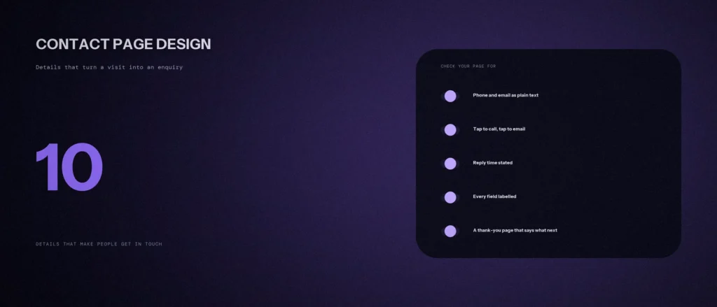
- The 10 details
- What our own contact page does, and where it falls short
- Common mistakes
- A prompt to review your contact us page
- Questions about contact page design
What a contact us page has to do
Think about who arrives on a contact page. They have already decided to ask. They are not browsing. So the page does not need to persuade anyone. It needs to answer four questions fast:
- How can I reach you?
- Is this a real business, in a real place?
- What will happen if I send something?
- How long will it take?
Every detail below answers one of those four. A page that answers all four with no effort feels easy. A page that leaves one open makes the visitor guess, and some of them will leave instead.
The 10 details
1. Show your contact details in plain text
Do not hide the phone number and email behind a form. Nielsen Norman Group’s research on trustworthy design says people appreciate sites that are upfront with information that relates to the customer experience, and it includes prominently displaying contact information, with the utility navigation as a good place for it. The article is from 2016, so treat it as a long-standing finding and not a new one. A plain-text number also works for people who prefer to call, and for visitors who cannot use the form.
2. Offer more than one way to reach you
People differ. Some want to call, some want to type, and some will only WhatsApp. If you can handle several, list several: phone, email, a form and a messaging app. Put the one you want most near the top. Do not list a channel you do not check.
3. Make phone and email tappable
On a phone, a number that is just text forces the visitor to copy it, switch apps and paste it. Link it with a tel: link, and link the email with a mailto: link, so one tap starts the call or opens the mail app. It costs nothing and it is easy to miss.
4. State your hours, place and reply time
Say when you answer, where you are, and how fast you reply. “We reply within one working day” removes the worry about whether anyone will read the message. Hours also set expectations for calls: nobody wants to ring at 8 pm and hear nothing.
5. Keep the form as short as it can be
Ask only for what you need to reply well. Every extra field is a reason to stop. If you need more detail, get it in the reply. We cover the trade-offs in our post on form fields, so we will not repeat them here.
6. Label every field, and keep labels visible
W3C’s explanation of WCAG success criterion 3.3.2 says labels or instructions must be provided when content requires user input, so users know what information to enter. A label that sits outside the field stays visible while someone types. A placeholder inside the field disappears the moment typing starts. Use placeholders for examples only.
7. Tell the browser what each field is
The autocomplete attribute lets a browser fill in a name, email or phone number in one tap. W3C’s page on success criterion 1.3.5 says the goal is that it is easier to fill out forms, and it asks for code that indicates the purpose of common inputs.
8. Make buttons and links easy to hit
W3C’s target size guidance says the size of a target for pointer input should be at least 24 by 24 CSS pixels, with some exceptions. Small, crowded links near each other are hard to tap on a phone. Give the main button room, and space the phone, WhatsApp and email links apart.
9. Mark up your contact details
Structured data does not make the page easier for people, but it tells search engines the same facts. Google’s organization structured data page describes contactPoint as the best way for a user to contact your business, and says to include all support methods available. Its local business page lists address, telephone and opening hours. Keep the markup identical to what is on the page.
10. Confirm what happened after someone sends
A form that returns to a blank page leaves people wondering whether it worked. Send them to a page that says it was received, repeats the reply time, and gives a faster option if something is urgent. Test it. Fill in your own form on a phone and see what you see.
What our own contact us page does, and where it falls short
We checked our own contact page against the list on 11 October 2026, using the page’s own code.
| Detail | Our page |
|---|---|
| 1. Plain-text details | Yes: phone, WhatsApp, email, hours and a UAE number in view above the form |
| 2. More than one way | Yes: call, WhatsApp, email and the form |
| 3. Tappable | Yes: tel:, WhatsApp and mailto: links |
| 4. Hours and reply time | Hours and city are shown. The reply time is stated: one working day, with the audit within 48 hours |
| 5. Short form | Six fields, four of them required. The phone number is optional |
| 6. Visible labels | Yes: every field has a label linked to it. The placeholder is only used for an example |
| 7. Autocomplete | Yes: name, email, phone and website use the matching values |
| 8. Target size | Not measured. We have not tested this one, so we make no claim |
| 9. Markup | Yes: the page carries ContactPage and ContactPoint markup |
| 10. Confirmation | Yes: the form goes to a thank-you page that repeats the reply time and offers WhatsApp |
One gap, stated plainly: the page shows a city but no street address. That may suit a business that serves clients online, but some visitors look for a street address as proof that a place exists. We also found a second one while checking: the phone number was a required field, which is one more reason to stop and is not needed to send a reply. We made it optional after writing this list.
Common mistakes
- Only a form. Some visitors will not use it, and those visitors are lost.
- A contact link nobody can find. Put it in the main navigation and in the footer.
- An email address as an image. It cannot be tapped, copied or read by a screen reader.
- A required field that is not needed. If you will not use it in your first reply, drop it or make it optional.
- A CAPTCHA puzzle in front of every visitor. Our form uses a hidden trap field and a security token, so a real visitor solves nothing. That is our choice, and we have not compared it with a CAPTCHA, so treat it as an opinion and not a finding.
- No reply promise. If you cannot keep a promise to reply in one day, promise two, and keep it.
A prompt to review your contact page
An AI tool can check a contact us page against this list faster than you can read it. It cannot see your page layout, so paste the text and the form fields.
Act as a careful website usability reviewer. Review my contact page against the checklist below, using only what I paste.
My details:
– The text of my contact page, as a visitor reads it: [paste]
– My form fields, in order, with which are required: [list]
– What happens after someone submits the form: [describe]
– Who I want to hear from, and how fast I can reply: [for example “homeowners in Bangalore, same working day”]Checklist: plain-text contact details; more than one way to reach me; phone and email tappable; hours, place and reply time stated; short form; every field labelled; autocomplete values set; confirmation after sending.
Please do the following:
1. Mark each checklist item as present, missing or unclear, with the line from my text that proves it.
2. List the form fields I could remove or make optional, with the reason for each.
3. Rewrite my reply-time sentence and my confirmation message in plain English.
4. List what you could not judge from text alone, such as button size.Rules:
– Use only what I pasted. Do not invent details about my business.
– Say clearly when something is your opinion.
– Write in plain, simple English.
Then open your own page on a phone and test every item the AI could not judge.
Questions about contact page design
What should a contact page include?
Your phone number, email, a short form, your hours, your location or service area, and a line on when you reply. Add a messaging app if you use one. Nielsen Norman Group’s research says people appreciate prominent contact information.
How many fields should a contact form have?
As few as let you give a good first reply. Name, a way to reach them and a short message are usually enough. Every extra required field gives a visitor another reason to stop.
Should I put my phone number on the contact page?
Yes, if you answer it. Show it as text, and make it a tappable link so a phone user can call in one tap. A number you never answer does more harm than leaving it off.
Do I need a street address on the contact page?
If you have a place customers visit, yes. If you serve people online or at their location, a city or service area is honest and enough. Whatever you show, keep it the same as on your Google Business Profile. That is our advice, so that people see one set of facts.
Does a contact page help SEO?
Not as a ranking trick. Think of it as a conversion page: it matters because it turns visits into enquiries, and because clear contact details are one of the trust signals a visitor looks for.
Should the contact page have a map?
Only if people visit you in person. A map is useful for a clinic or a shop. For a business that works remotely it adds weight to the page and nothing else.
How do I know if my contact page works?
Count the form submissions, calls and WhatsApp taps, and compare them with the number of visits to the page. If many visit and few get in touch, test one change at a time.
Where this matters
A contact page does not need clever design. It needs the four answers: how to reach you, that you are real, what happens next and how soon. Check yours against the 10 details, fix the cheap ones first, and test the page on a phone.
If you want a second pair of eyes on your contact page, send us the address and we will tell you what we see.