You spent hours on your service page. Every paragraph says something true. And a visitor gives it about ten seconds, glances at the top, drops their eyes down the left edge, and either finds what they need or leaves. Writing a good page is only half the job. The other half is laying it out so that a person who is scanning, not reading, still finds the point.
This post covers how people read websites, using the eye-tracking and usability research from Nielsen Norman Group (NN/g), and turns it into rules for a business page. We read the NN/g articles on 11 October 2026, and we measured the structure of four pages on our own site. Several of the studies are old, and we give the date each time. Our post on writing website copy that sounds like a person covers voice. This one is about structure.
Quick summary, if you’re short on time:
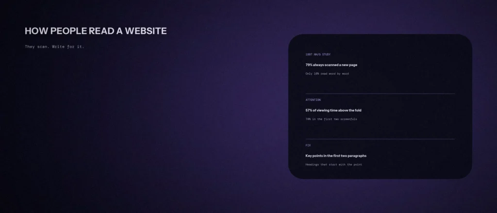
- In a 1997 NN/g study, 79 percent of test users always scanned any new page, and only 16 percent read word by word.
- NN/g’s eye-tracking research describes four scanning patterns: F-pattern, spotted, layer-cake and commitment. Big blocks of unformatted text lead to F-pattern scanning.
- In NN/g’s most recent scrolling study, users spent about 57% of their page-viewing time above the fold, and 74% in the first two screenfuls.
- NN/g’s fixes: put the most important points in the first two paragraphs, use clear headings that start with the words carrying the most information, group related content, bold important words, and use short lists.
- Our own service pages are well structured, but two of them still have paragraphs of 72 to 92 words that most scanners would skip.
UX designers call this scanning behavior. Users scan content, follow reading patterns that favour the top and the left of the page, and may not read the entire page. In web design terms, your important information and your navigation have to work for a visitor who is scanning. Good user experience and content strategy start from that fact.
Jump to a section:
- People scan, and the research is consistent about it
- The four scanning patterns
- Where attention goes on the page
- Seven rules for writing a page that gets scanned
- A before and after example
- What we measured on our own pages
- A prompt to restructure your page
- Questions about how people read websites
People scan, and the research is consistent about it
NN/g’s article How Users Read on the Web, from 1997, starts with the answer: they don’t. It says people rarely read web pages word by word and instead scan, picking out individual words and sentences. In that research, 79 percent of test users always scanned any new page, and only 16 percent read word by word. The study is nearly 30 years old, and its authors later noted that people read email newsletters even more abruptly than websites.
The same group tested how writing style changed usability. In a 1997 study using a sample website, a version written concisely scored 58% higher in measured usability, one with scannable text scored 47% higher, and one written objectively instead of promotionally scored 27% higher. Combining all three gave 124% higher measured usability. It was one sample site and it is old, so treat the percentages as an illustration of direction, not a number to expect on your page.
The four scanning patterns
NN/g’s article on text scanning patterns says eye-tracking research shows four main patterns people use to scan text on web pages.
| Pattern | What it looks like | What it means for your page |
|---|---|---|
| F-pattern | With no subheadings or bullets, people fixate on words at the start of lines and near the top of the page | Walls of text lose the right side and the lower half |
| Spotted | Fixations on specific words spread through the page, such as links, bold words, numbers or bulleted lists | Make the important words look different, and name links clearly |
| Layer-cake | Fixations mostly on headings and subheadings, then reading the text under the one they want | Your headings must carry the message |
| Commitment | Reading all or most of the text, usually when people are very interested or motivated to read | You earn this with a clear first screen and a relevant page |
NN/g’s article on the F-shaped pattern adds two warnings. Scanning on the web does not always take the shape of an F, and good web formatting reduces its impact. The F-pattern, it says, is bad for users and businesses because people may skip important content simply because it sits on the right side of the page.
Where attention goes on the page
NN/g’s study Scrolling and Attention reports that, in its most recent study, users spent about 57% of their page-viewing time above the fold, and 74% of the viewing time in the first two screenfuls, up to 2,160 pixels. That is a change from its 2010 article, when 80% of viewing time was above the fold, because people now scroll more. The first screen still gets the most attention. We covered what has to be there in our post on above-the-fold design.
Seven rules for writing a page that gets scanned
These come from NN/g’s list of “antidotes” to the F-shaped pattern, plus its work on scannable text. Rules 6 and 7 are our own additions, applying them to a service business.
- Put the most important points in the first two paragraphs. NN/g says this directly.
- Use headings and subheadings, and make them look more important than normal text so people can tell them apart quickly.
- Start headings with the words that carry the most information. NN/g says that if users see only the first two words, they should still get the gist of the section. Its 2009 study found that users typically see about two words of most list items.
- Visually group small amounts of related content, for instance with a border or a different background.
- Bold the important words and phrases. Do not bold whole paragraphs.
- Keep paragraphs short. Our own rule of thumb is two to four sentences, one idea each. A paragraph over about 60 words is a good place to look for a split.
- Turn lists of three or more things into a list, with the most useful word first in each item.
A before and after example
This is an invented example for a dental clinic. It shows the shape of the change. It is not real copy from a client.
Before (one paragraph, 61 words): “Our clinic offers a range of services including root canal treatment, dental implants, braces and clear aligners, teeth whitening and wisdom tooth removal, and we also provide a children’s dentistry service with a friendly approach, and our appointments run from 9 am to 8 pm on weekdays and until 2 pm on Saturdays, so you can book a time that fits.”
After (a heading and two short lists):
Treatments at Indiranagar Dental Clinic
- Root canal treatment
- Dental implants
- Braces and clear aligners
- Teeth whitening
- Wisdom tooth removal
- Children’s dentistry
Opening hours
- Monday to Friday: 9 am to 8 pm
- Saturday: 9 am to 2 pm
Only filler words were dropped. Every treatment and every opening time is still there, and each now has its own place a scanning eye can land on.
What we measured on our own pages
We measured the main content of four pages on our own website on 11 October 2026. “Words” counts the main content only. “Longest paragraph” counts the words in the longest paragraph of six words or more.
| Page | Words | Headings | Headings per 1,000 words | Longest paragraph |
|---|---|---|---|---|
| Homepage | 1,346 | 30 | 22.3 | 40 words |
| Academy | 1,357 | 37 | 27.3 | 43 words |
| Local SEO page, Bangalore | 2,534 | 39 | 15.4 | 92 words |
| SEO services | 1,253 | 21 | 16.8 | 72 words |
The homepage and the Academy page keep paragraphs short and have plenty of headings. The Local SEO page and the SEO services page each have at least one paragraph of more than 70 words, which is the kind of block NN/g says scanners skip. They are on our list to split. This is a simple structural check, not a measure of how well the pages work.
A prompt to restructure your page
An AI tool can find long paragraphs and propose headings. It cannot see your layout or know your facts, so give it the text, and tell it to keep every fact as it is.
Act as a careful web editor. Restructure my page text so a visitor who scans can find the main facts, without changing any facts.
My details:
– What the business does and who the page is for: [for example “a physiotherapy clinic in Whitefield, page for back pain treatment”]
– The page text, in order, with headings marked: [paste]
– The one action I want visitors to take: [for example “call to book”]Please do the following:
1. List every paragraph over 60 words, with its word count, and propose how to split it.
2. Say whether my first two paragraphs contain the most important points, and if not, which sentences should move up.
3. Rewrite each heading so its first two words carry the most information, and show the old and new heading side by side.
4. Find any run of three or more items inside a paragraph and show it as a list.
5. List what you cannot judge without seeing the page layout.Rules:
– Do not add, remove or change any fact, number, price or claim.
– Do not invent headings that promise something the text does not say.
– Say clearly when something is your opinion.
– Write in plain, simple English.
Read the result as a visitor would, scanning the headings only, and check the page still makes sense.
Questions about how people read websites
Do people really read websites?
Mostly they scan. In a 1997 NN/g study, 79 percent of users always scanned a new page and only 16 percent read word by word. People read more closely when the content is highly relevant to them.
What is the F-pattern?
An eye-tracking pattern NN/g reported in 2006, where people fixate on words at the start of lines and near the top when text has no subheadings or bullets. NN/g says it is not the only pattern, and that good formatting reduces it.
How long should a paragraph be on a website?
NN/g gives no word count. Our rule of thumb is two to four sentences, one idea each, and a look at anything over about 60 words.
Does content above the fold matter more?
It still gets the most attention. NN/g’s latest study found about 57% of viewing time above the fold and 74% in the first two screenfuls, though people scroll more than they did in 2010.
Should every page have bullet points?
Use them for three or more parallel items, such as treatments, steps or prices. NN/g says bulleted lists draw the eye in the spotted pattern. Do not turn explanations into bullets, because they lose their reasoning.
Is short copy always better?
No. NN/g’s study found that concise, scannable and objective writing each improved usability on a sample site, but a page that answers a serious decision, such as a service you pay for, needs depth. The goal is easy to scan and complete, not short.
How do I check if my page is scannable?
Read only the headings and the first two paragraphs. If a stranger can say what you do, where, and what to do next, the page passes. If not, rewrite the headings first.
Where this matters
People scan, so the structure has to work before anyone reads a word. Put the main points in the first two paragraphs, give each section a heading that starts with the point, and split any block of text over about 60 words.
If you would like us to review the structure of one of your pages, send us the address and we will tell you what we see.