“Above the fold” gets treated like a fixed rectangle: cram the logo, the headline, the offer and a button into it, and the page is done. That rectangle does not actually exist anymore, not in one consistent size.
It changes with every screen, every browser chrome height, every device someone happens to be holding. Designing for a single fold is designing for a shape that is different for almost every visitor.
Quick summary, if you’re short on time:
- Nielsen Norman Group’s 2018 eye-tracking study found people spend 57% of their page-viewing time above the fold, and 74% within the first two screenfuls, down from 80% above the fold in their 2010 study.
- Chartbeat’s data, reported by former CEO Tony Haile, found 66% of reader attention on a typical page happens below the fold, with engaged time actually peaking just past it.
- Both numbers are true at once. The area visible without scrolling still gets outsized attention per pixel, but it is not where most engaged time ends up.
- What matters is not fitting everything above the fold. It is making sure the visible slice answers one question fast: what is this, and is it for me.
- Mobile makes the fold shorter and less predictable than desktop, which changes what actually deserves that space.
Jump to a section:
- The above-the-fold myth, and what the data actually says
- What “above the fold” means when there is no fixed fold
- What actually needs to be visible without scrolling
- What can safely wait below
- Why mobile changes the whole calculation
- Using AI to audit your own above-the-fold section
- Questions worth answering directly
The above-the-fold myth, and what the data actually says
The idea that below-the-fold content barely gets seen has been circulating since print newspapers folded in half on newsstands. Online, it never quite matched reality, and the gap has only grown.
Nielsen Norman Group’s 2018 eye-tracking study, based on more than 130,000 eye fixations across 120 participants, found people spend 57% of their page-viewing time above the fold. That is down sharply from the 80% their 2010 study recorded, evidence that scrolling behaviour itself has genuinely shifted.
Chartbeat’s own data tells a complementary story. Former CEO Tony Haile reported that 66% of reader attention on a typical page happens below the fold, and that engaged time actually peaks a little past it, not right at the top.
Neither number cancels the other out. The visible area still earns more attention per pixel than anywhere else on the page. It is simply no longer true that people rarely scroll, or that content below the fold goes unread.
What “above the fold” means when there is no fixed fold
A 13-inch laptop, a 27-inch monitor and a phone in one hand all show a different amount of a page before any scrolling happens. There is no single pixel height that qualifies as “the fold” across all of them.
What stays constant is the idea behind it: whatever is visible in that first view has to do real work, because it is the only part of the page every single visitor is guaranteed to see. Everything below it is seen by fewer people, in decreasing numbers, the further down the page it sits.
That is the useful way to think about it. Not a fixed rectangle to fill, but a shrinking pool of guaranteed attention that the top of the page has to spend well.
What actually needs to be visible without scrolling
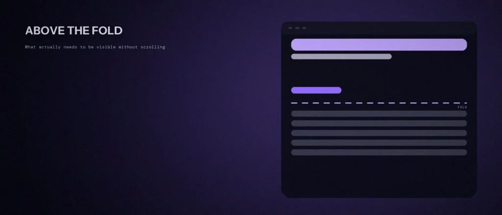
Three things earn a place in that guaranteed-attention zone, and almost nothing else does. First, a clear statement of what the business does, in language a stranger would understand in one read, not internal jargon.
Second, enough of a reason to believe it is worth continuing: a specific outcome, a number, a recognisable client, anything more concrete than “we deliver excellence.” Third, one obvious next step, usually a single primary button, not three competing calls to action fighting for the same click.
That is the whole list. A navigation bar can sit above it. A hero image can support it. But if the top of the page cannot answer “what is this and is it for me” in about three seconds, no amount of below-the-fold content will save the visit.
What can safely wait below
Feature lists, pricing tables, testimonials, FAQs and detailed process explanations all have a place on a good page. None of them need to fit above the fold, and forcing them up there is usually what makes a hero section feel cramped and unreadable.
The Chartbeat data is the useful permission slip here: engaged time genuinely does peak just past the fold, meaning a visitor who scrolls even a little is still paying attention, often more than they were at the very top. The job of the fold is to earn that first scroll, not to replace everything that comes after it.
Why mobile changes the whole calculation
On a phone, the visible area before scrolling is a fraction of what a desktop monitor shows, often under 700 pixels tall once the browser’s own address bar and navigation are accounted for. A headline, subheading, image and button that fit comfortably on desktop can easily push the button off-screen on mobile.
This matters more than it used to, for a reason covered in more depth in our post on mobile-first indexing: Google indexes and evaluates the mobile version of a page as the default, not the desktop one. An above-the-fold section that only works on a large screen is, in a very real sense, not the version of the page that counts most.
The practical fix is designing the mobile view first, or at minimum testing it as seriously as the desktop layout, rather than treating mobile as a scaled-down afterthought.
Using AI to audit your own above-the-fold section
A screenshot of the current homepage, cropped to exactly what shows without scrolling on both desktop and mobile, is enough to get a genuinely useful review.
“Act as a conversion-focused web designer reviewing the attached above-the-fold screenshot of my homepage, on [desktop / mobile, or both].
Tell me plainly:
1. Within three seconds, is it clear what the business does and who it’s for? If not, what’s ambiguous?
2. Is there one clear next step, or are multiple calls to action competing for attention?
3. Is there any concrete reason to believe this business over a competitor, or is it generic language that could apply to anyone?
4. What would you remove first to make room, without adding anything new?”
The value is in the specific, current screenshot, not a general description of the page. A layout that reads fine in your head can look completely different once it is actually cropped to what a first-time visitor sees.
Questions worth answering directly
Is above-the-fold design still worth caring about, given how much people scroll now?
Yes. Nielsen Norman Group’s research still shows the visible area earns the most attention per pixel on the page, even as overall scrolling behaviour has increased. It just is not the only area that matters anymore.
What is the single biggest above-the-fold mistake?
Competing calls to action. Three buttons of similar visual weight, each pointing somewhere different, make a visitor pause to decide instead of acting, which usually means they do neither.
Should the same hero section be used for desktop and mobile?
Not without checking both separately. A layout built and approved on desktop can push the headline, image and button into an awkward, cut-off arrangement on a phone screen, which is the version Google evaluates first.
How much text is too much for an above-the-fold section?
If it takes longer than a few seconds to read, it is competing with the goal of the section rather than supporting it. A short headline and one supporting line usually outperform a paragraph of explanation up top.
What did Nielsen Norman Group’s 2018 eye-tracking study find?
Based on more than 130,000 eye fixations across 120 participants, it found people spend 57% of their page-viewing time above the fold. That is down from 80% in the group’s 2010 study, evidence that scrolling behaviour has genuinely shifted.
What actually needs to be visible without scrolling?
Three things. A clear statement of what the business does, enough of a reason to believe it (a specific outcome, number or recognisable client), and one obvious next step, usually a single primary button. Feature lists, pricing, testimonials and FAQs can wait below.
Where this actually pays off
The fold is not dead, and it is not everything either. It is the one part of a page every visitor is guaranteed to see, which makes it worth getting right, and a poor reason to cram in everything the business wants to say.
Not sure whether your own homepage is using that guaranteed attention well, on both desktop and mobile? We review this as part of every website design and development engagement we run.