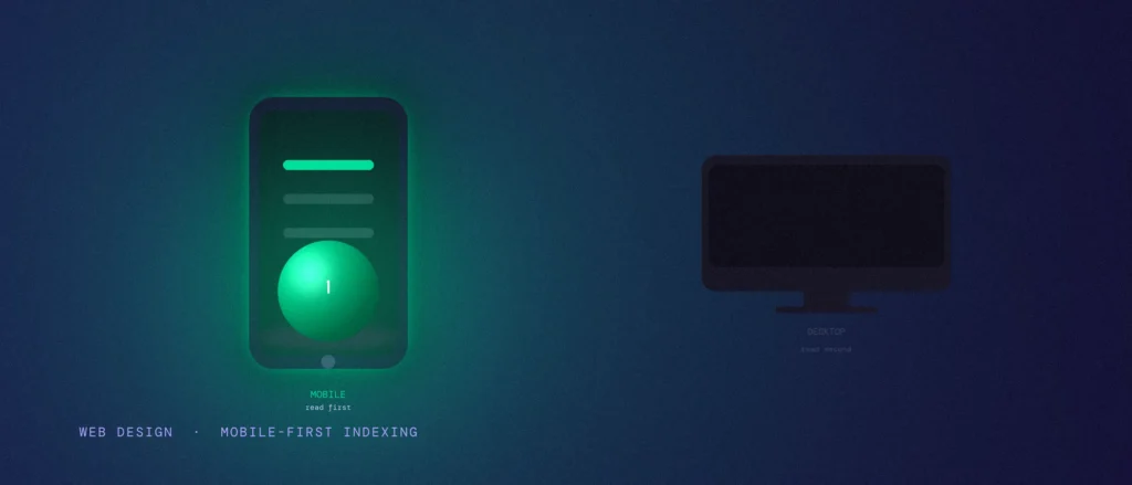
Here is something that surprises a lot of business owners. Even if nine out of ten people who visit your website are on a laptop, Google does not care. It looks at your phone version first, decides what your site is about from that, and ranks you based on it. Your beautiful desktop layout barely matters to Google at all.
If you run a clinic, a home services business, or any other service business where people research you before calling, this affects you directly, even if most of your actual customers browse on a laptop at work.
Quick summary, if you’re short on time:
- Google finished switching every website to “mobile-first indexing” in 2024. It now uses your phone version as the main copy it reads and ranks, not your desktop version.
- If your mobile site is missing content, links, or images that your desktop site has, Google may simply not know that content exists.
- Small tap targets, tiny text, and pop-ups that block the screen all hurt you on mobile, even if your desktop site is spotless.
- Google retired its old Mobile-Friendly Test tool in December 2023. Checking mobile health today means looking at Core Web Vitals and the Page Experience report instead.
- The fix is usually not a full redesign. It’s making sure your mobile site says and shows everything your desktop site does.
Jump to a section:
- What “mobile-first indexing” actually means
- Why Google switched to this in the first place
- The mistake that quietly costs the most: hidden content
- Small buttons and text people can’t use
- Pop-ups that block the page
- Mobile-first indexing SEO: how to check your own site
- What this looks like in practice
- Questions worth answering directly
What “mobile-first indexing” actually means
For a long time, Google mostly used the desktop version of a website to decide how it should rank. Mobile-first indexing flipped that. Google now sends its phone version of Googlebot to your site, reads the mobile version of your pages, and uses that as the main copy for both understanding your content and ranking it.
Google said this rollout was finally complete for every website in 2024, after starting it gradually back in 2018 (reported by Search Engine Land). So this isn’t a future change you need to prepare for. It’s already how your site is being judged, right now, whether you knew about it or not.
Why Google switched to this in the first place
The simple reason: most searches happen on a phone. Google wants its results to match what a real searcher will actually see when they land on your page. If Google judged your site by a desktop version that looks nothing like what a phone user gets, it would be sending people to an experience it never actually checked.
This matters even for businesses that get most of their paying customers from desktop, like B2B services or high-value purchases people research at their office computer. Google still reads and ranks your mobile version first. A weak mobile site can quietly cap how well you rank everywhere, desktop included.
The mistake that quietly costs the most: hidden content
Here’s the one that catches people out. On many mobile designs, some content gets tucked behind a “read more” link, an accordion, or a tab, to save space on a small screen. That’s a fine design choice by itself. The problem shows up when the mobile version leaves out something the desktop version has entirely, like a paragraph, a set of links, or a whole section, instead of just tucking it behind a click.
Google reads what’s actually in your mobile page’s code. If a chunk of your desktop content genuinely doesn’t exist on mobile, not even collapsed behind a tab, Google’s main understanding of your page never includes it. You could have a fantastic paragraph explaining your services on desktop that Google has effectively never seen, because it wasn’t carried over to mobile at all.
Small buttons and text people can’t use
A “tap target” is just the clickable area around a button or link. On a phone, fingers are a lot less precise than a mouse pointer. If your buttons, menu links, or “Call us” icons are packed too close together, people miss, tap the wrong one, and leave frustrated.
Text size causes the same kind of quiet damage. If someone has to pinch and zoom just to read a sentence, that’s friction most visitors won’t push through. They’ll just leave. This isn’t only a ranking issue. It’s a straightforward lost-enquiry issue, since the person who left never saw your phone number or your contact form at all.
Pop-ups that block the page
A pop-up that covers most of the screen the second someone lands on your mobile page, before they’ve read a single word, is one of the clearest ways to frustrate a mobile visitor. Google has been factoring this kind of intrusive interstitial into rankings for years, and it’s even more noticeable on a small screen, where a full-screen pop-up can block literally everything.
This doesn’t mean you can never use pop-ups. A small banner, or a pop-up that only appears after someone has scrolled and shown real interest, is a very different experience from one that blocks the page before anyone has read anything.
Mobile-first indexing SEO: how to check your own site
Google retired its old, dedicated Mobile-Friendly Test tool and the Mobile Usability report inside Search Console in December 2023. If you go looking for those, you’ll just get redirected. Google folded mobile checks into its broader Page Experience guidance instead, and now points site owners toward Lighthouse and Core Web Vitals data for a fuller picture.
In practice, that means: open your site’s Core Web Vitals report inside Search Console, run your key pages through PageSpeed Insights using the mobile setting specifically, and, just as importantly, open your own site on your own phone and try to actually use it. Read the content. Tap the buttons. Fill in the contact form. If anything about that feels clumsy to you, it’s clumsy for everyone else too.
If you’d rather have someone else check it properly, request a free mobile SEO audit and we’ll go through your site on an actual phone, not a desktop preview.
What this looks like in practice
Picture a Bengaluru clinic that built a solid desktop website, then had a developer bolt on a mobile version to save time. On desktop, the doctor’s full bio, qualifications, and a list of every treatment offered are all visible on the homepage. On mobile, to keep the page short, the bio got dropped completely and the treatment list got cut down to just four items.
To a visitor, that might look like a reasonable trim. To Google, that clinic’s mobile homepage, the version being used to judge the whole site, no longer mentions most of what the clinic actually treats, or who the doctor even is. The fix isn’t a redesign. It’s making sure every treatment, every trust signal, and every real piece of content that exists on desktop also exists somewhere on mobile, even if it’s organised differently to fit a smaller screen.
For a local business like this, that gap doesn’t just cost rankings in general, it costs the specific visibility a clinic needs to show up when someone nearby searches for a treatment it actually offers. That’s exactly the kind of gap we check for as part of local SEO work, not just a general SEO pass.
Questions worth answering directly
Does my desktop site even matter anymore?
Yes, for the actual visitors who use it. But for ranking purposes, Google is primarily reading your mobile version. Your desktop site should still be excellent, just not at the cost of leaving content out of the mobile one.
Is it fine to hide content behind tabs or accordions on mobile?
Yes, as long as the content genuinely exists in the page and just needs a tap to expand. The problem is content that’s missing entirely on mobile, not content that’s collapsed but present.
How do I check if my site is mobile-friendly now that Google’s old tool is gone?
Use PageSpeed Insights on the mobile setting, check the Core Web Vitals report in Search Console, and manually try using your own site on your own phone.
Do pop-ups always hurt my ranking?
Not always. A full-screen pop-up that blocks the page the instant someone lands is the risky kind. Smaller banners, or pop-ups triggered by scroll or exit intent, are a different, lower-friction experience.
My site gets most of its leads from desktop searches. Does mobile-first indexing still apply to me?
Yes. Google ranks your site based on the mobile version regardless of where your actual traffic comes from. A weak mobile version can hold back your desktop rankings too.
How do I fix mobile-first indexing issues?
Start by comparing your mobile and desktop pages side by side and note anything missing on mobile, not just collapsed. Then check tap target spacing and text size on a real phone, remove or delay any pop-up that blocks the page on arrival, and run your key pages through PageSpeed Insights on the mobile setting to catch what’s left.
Once your mobile version is right, Core Web Vitals is the next layer worth checking, since Google measures most of those metrics primarily from mobile visits.
Where this actually pays off
Mobile-first design isn’t really about making a site look nice on a small screen. It’s about making sure the version of your site that Google actually reads says everything your business needs it to say. Most fixes here are not expensive rebuilds, they’re a careful pass through your mobile pages checking what’s missing, what’s too small, and what’s getting in the way.
Not sure if your mobile site is quietly leaving out content Google should be seeing, or costing you enquiries through fiddly buttons and forms? Share your site and we’ll check it properly, on an actual phone, not just a desktop preview, as part of every website development project we take on.