CTA placement is what most websites treat as an afterthought: pick a color, pick a corner, move on. Then the owner wonders why traffic looks fine but enquiries don’t. The button isn’t broken. It’s usually just sitting somewhere nobody’s eyes ever land.
How many CTAs a page needs, and exactly where they go, isn’t a design taste question. It follows directly from how people actually scan a page, and that behaviour has been measured, not guessed at.
Quick summary, if you’re short on time:
- Nielsen Norman Group’s own research found 79% of web users scan a new page rather than reading it word by word, only 16% read closely, so a CTA has to survive a scan.
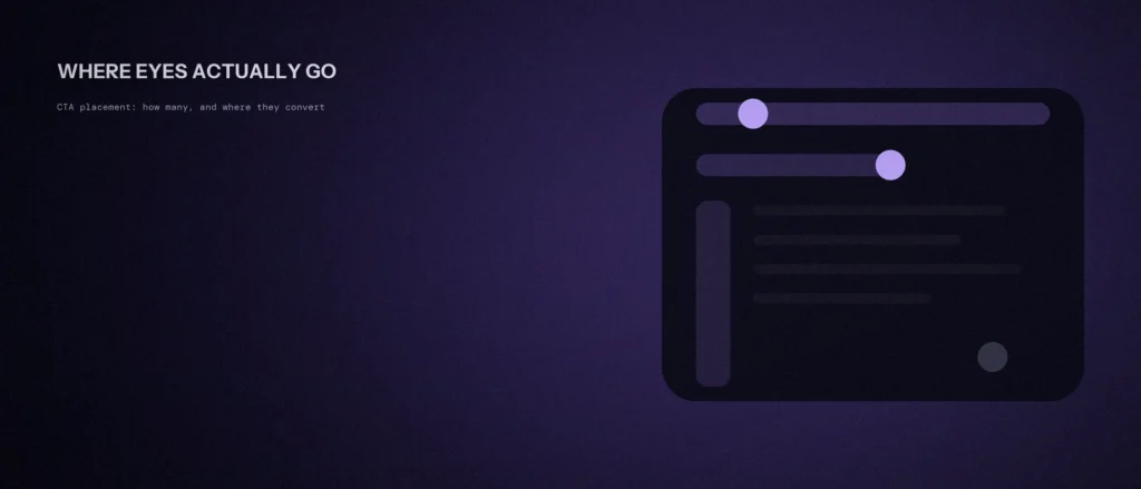
- People scan in a rough F-shape: heavy attention across the top, less across a second horizontal band further down, and a thin trail down the left edge after that.
- That means content on the right side of a page, or buried deep after a long block of text, gets far fewer eyes than content in that F-shaped path.
- Most service pages need at least three CTAs: one above the fold, one after the strongest proof point, and one at the natural end of the page, not one lonely button at the bottom.
- A repeated CTA isn’t nagging. It’s meeting the visitor wherever they stopped scanning and decided to act.
Jump to a section:
- What is a call to action (CTA)?
- How people actually scan a page
- How many CTAs a page actually needs
- Where each one should actually go
- What breaks a CTA’s placement
- A prompt to review your call-to-action placement
- Questions worth answering directly
What is a call to action (CTA)?
A call to action, or CTA, is the button or link that asks a visitor to take the next step, such as “Get a quote,” “Call now” or “Book a visit.” CTA placement is about how many of these a page has and where they sit, so a visitor can act at the moment they are ready.
How people actually scan a page
Nielsen Norman Group’s eye-tracking research is direct about this: 79% of users scan any new page, and only 16% read word by word. A button isn’t competing for careful attention. It’s competing for a fraction of a second of a scanning eye.
That scanning tends to follow a rough F-shape. Their eye-tracking data shows people read “in a horizontal movement, usually across the upper part of the content area,” then a second, shorter horizontal pass further down, then a vertical scan down the left edge. The practical result: “users may skip important content simply because it appears on the right side of the page,” or because it sits past where their attention already thinned out.
A CTA placed outside that path isn’t a weak CTA. It’s an invisible one.
How many CTAs a page actually needs
One CTA, sitting only at the very bottom of a long page, assumes every visitor reads the whole thing before deciding. Almost none do. Someone convinced after the second paragraph shouldn’t have to keep scrolling to find a button, and someone who needed the full page to decide shouldn’t be left with nothing once they finally get there.
Most service and landing pages need three placements, not one: above the fold before any scrolling, right after the section that makes the strongest case, and again at the natural end of the page. Fewer than that and you’re relying on visitors to remember to scroll back up. More than that on a single view, stacked close together, starts to look like desperation rather than confidence.
Where each one should actually go
The first CTA sits in that top F-band, visible without scrolling, next to whatever line is doing the actual explaining, not competing with it. This is the same real estate covered in our guide to the homepage hero, since a hero that’s unclear makes the CTA next to it meaningless regardless of placement.
The second CTA belongs right after whatever on the page is doing the most convincing, a result, a specific number, a before-and-after, not after a generic paragraph of description. That’s the moment someone’s attention is highest, and it’s also usually somewhere past that first horizontal scanning band, so it needs its own visual weight to get noticed rather than relying on momentum from the top.
The third CTA closes the page. By the time someone reaches the bottom, they’ve either decided or they’re still undecided and looking for a reason to leave. A clear, specific closing CTA is the last chance to convert that decision before they do.
What breaks a CTA’s placement
The most common mistake is a single CTA sitting right after a wall of text with no visual separation, so it reads as just another paragraph rather than a decision point. Scanning eyes move past text that looks like more text.
The second is placing the strongest CTA on the right side of a layout, competing directly with the scanning pattern’s blind spot, or burying it inside a sidebar that the F-pattern skips almost entirely. The fix isn’t a brighter color. It’s moving the button into the path people are already looking at, not asking them to look somewhere new.
A prompt to review your call-to-action placement
A page can have good content and still lose visitors because the next step is missing or hard to find. The prompt below helps you review your own pages. Paste in the page text and a description of where each button sits.
Act as a conversion-focused web editor. Review one page of my website for call-to-action placement.
The page:
– What the page is for: [for example a service page]
– The action I want a visitor to take: [call, form, booking]
– The page text: [paste it here]
– Where my buttons and forms are now: [describe, for example after the hero and at the footer]Please do the following:
1. Say whether a visitor who reads only the first screen knows what to do next.
2. Point out spots where the reader is ready to act but has no button.
3. Suggest where to add, move or remove calls to action, and give a reason for each.Rules:
– Do not suggest more than one main action per page.
– Do not invent visitor data. Base the review on the text I gave you.
– Keep the advice plain.
Make one change at a time and check your form and call numbers afterwards. That way you know which change helped.
Questions worth answering directly
How many call-to-action buttons should one page have?
Most service or landing pages need at least three: one above the fold, one after the strongest proof point on the page, and one at the natural end. A single CTA only at the bottom misses everyone who decided earlier and never kept scrolling.
Does repeating the same CTA multiple times hurt conversions?
No, as long as each one sits at a genuine decision point rather than being crammed together. Repetition meets visitors wherever they stopped scanning and decided to act, which is different from stacking several buttons in the same view.
Why does a CTA placed on the right side of a page underperform?
Eye-tracking research shows users scan pages in a rough F-shape, with heavy attention across the top and down the left edge. Content on the right side of the layout falls outside that path and gets seen far less often, regardless of how the button itself is designed.
What share of visitors scan a page instead of reading it?
Nielsen Norman Group’s eye-tracking research found 79% of users scan any new page, while only 16% read word by word. A button is competing for a fraction of a second of a scanning eye.
Where should the first CTA on a page go?
In the top F-band, visible without scrolling, next to the line that is doing the actual explaining. If the hero is unclear, the CTA beside it means little regardless of placement.
What is the most common CTA placement mistake?
A single CTA sitting right after a wall of text with no visual separation, so it reads as another paragraph. Scanning eyes move past text that looks like more text.
Where this actually matters
A page can say exactly the right thing and still convert poorly if the button asking someone to act isn’t where their eyes actually go. Placement isn’t decoration, it’s the difference between a CTA that gets clicked and one that technically exists.
Not sure if your own site’s CTAs are actually sitting where visitors look? We check this as part of every website engagement we run.